LINKSDAO
A static list of partner perks became a benefits storefront and a points system that later fed LinksDAO's token distribution.
- Role
- UX Design Consultant, contract
- Year
- 2022–23
- Platform
- Web and mobile web
- Status
- Shipped
Problem
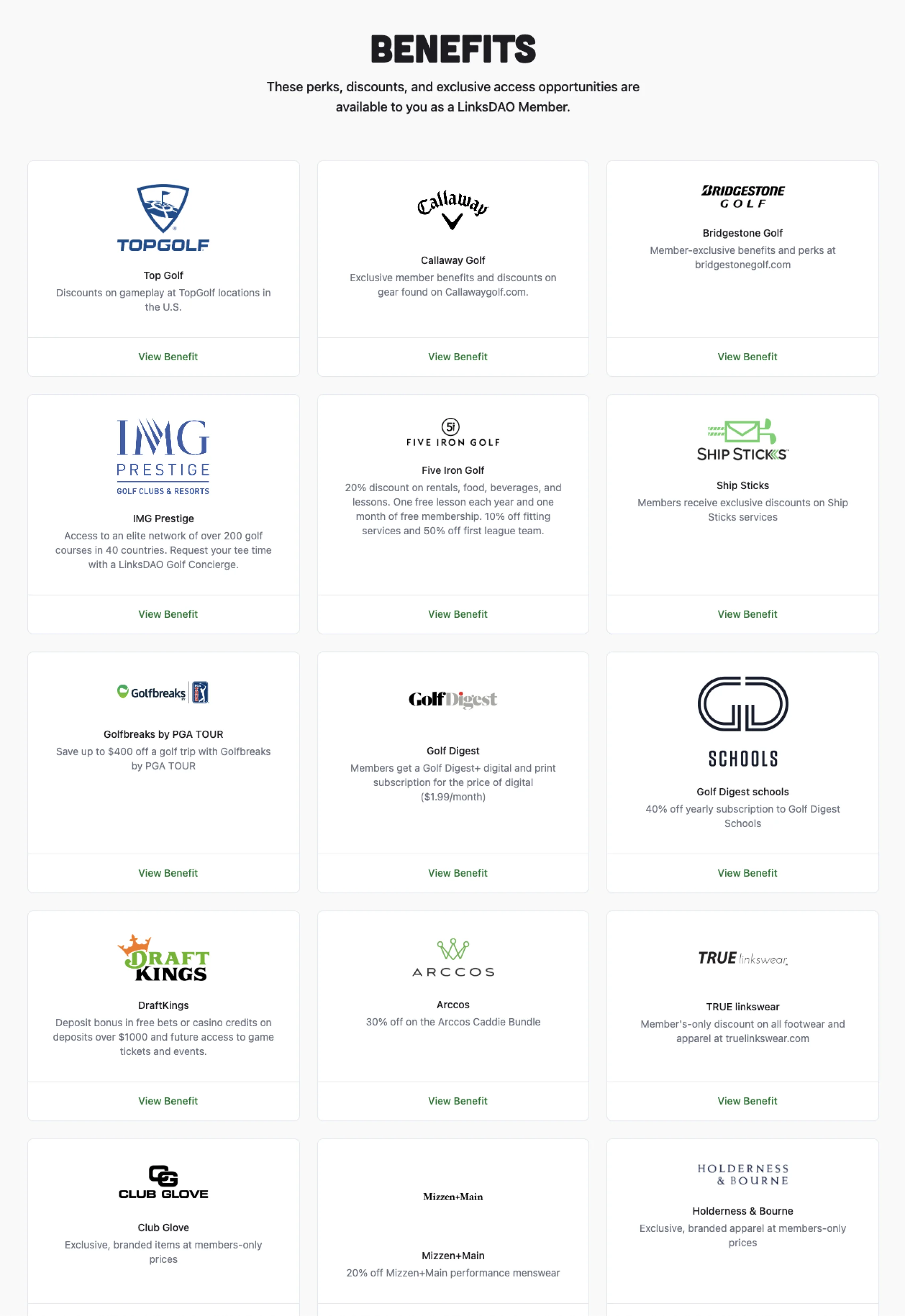
Member perks sat in a static grid of partner logos. Every perk looked the same, and nothing said what you would get.
Approach
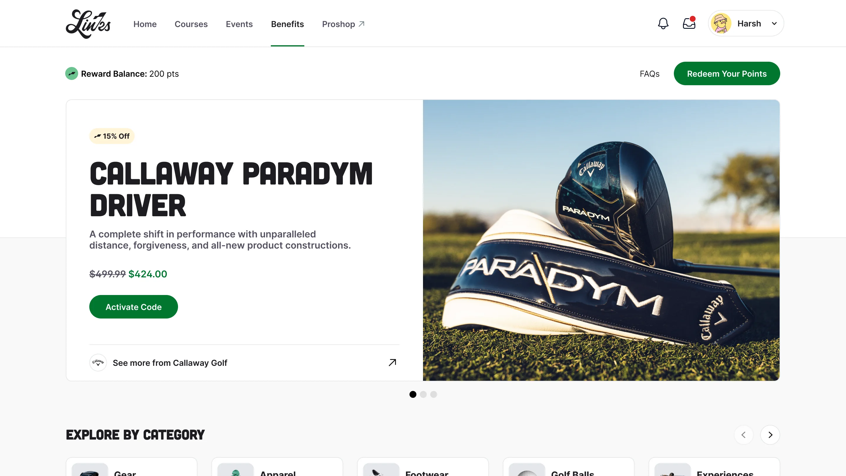
Benefits rebuilt as a storefront, with one card system for discounts and points, and one predictable way to claim each kind.
Result
Shipped in the Clubhouse. The points it tracked were later used in LinksDAO's token distribution.
01 · Problem
Every perk looked the same.
LinksDAO members hold a membership NFT that unlocks perks from partners such as Callaway, TopGolf and Bridgestone. The Benefits page listed each partner as a logo, one line of text and a "View Benefit" link. A site-wide discount, a tee-time concierge and a magazine subscription were indistinguishable. There was no way to browse by what you wanted, and each new partner meant a manual page edit.
02 · Decision
A storefront, not a directory.
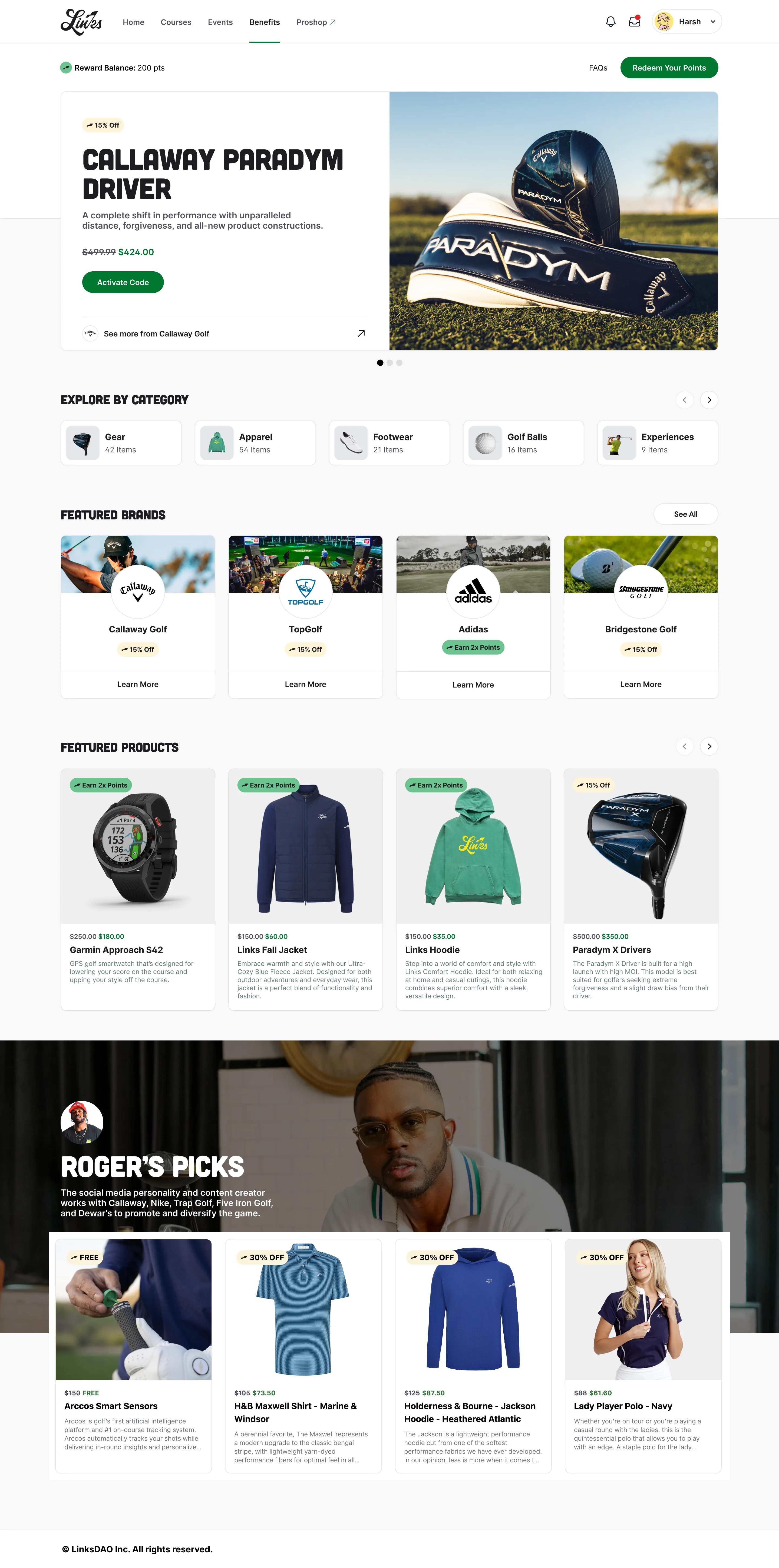
Benefits became a shop: a featured offer, categories, brands, products and curated picks from people members follow.
- Chose
- A browsable shop with featured, categories, brands, products and curated picks
- Instead of
- A tidier partner grid with filters
- Because
- Members arrive wanting gear or an experience, not a partner name. A shop gives every visit something new and gives Links places to feature a partner.
03 · Decision
Two kinds of benefit, one system.
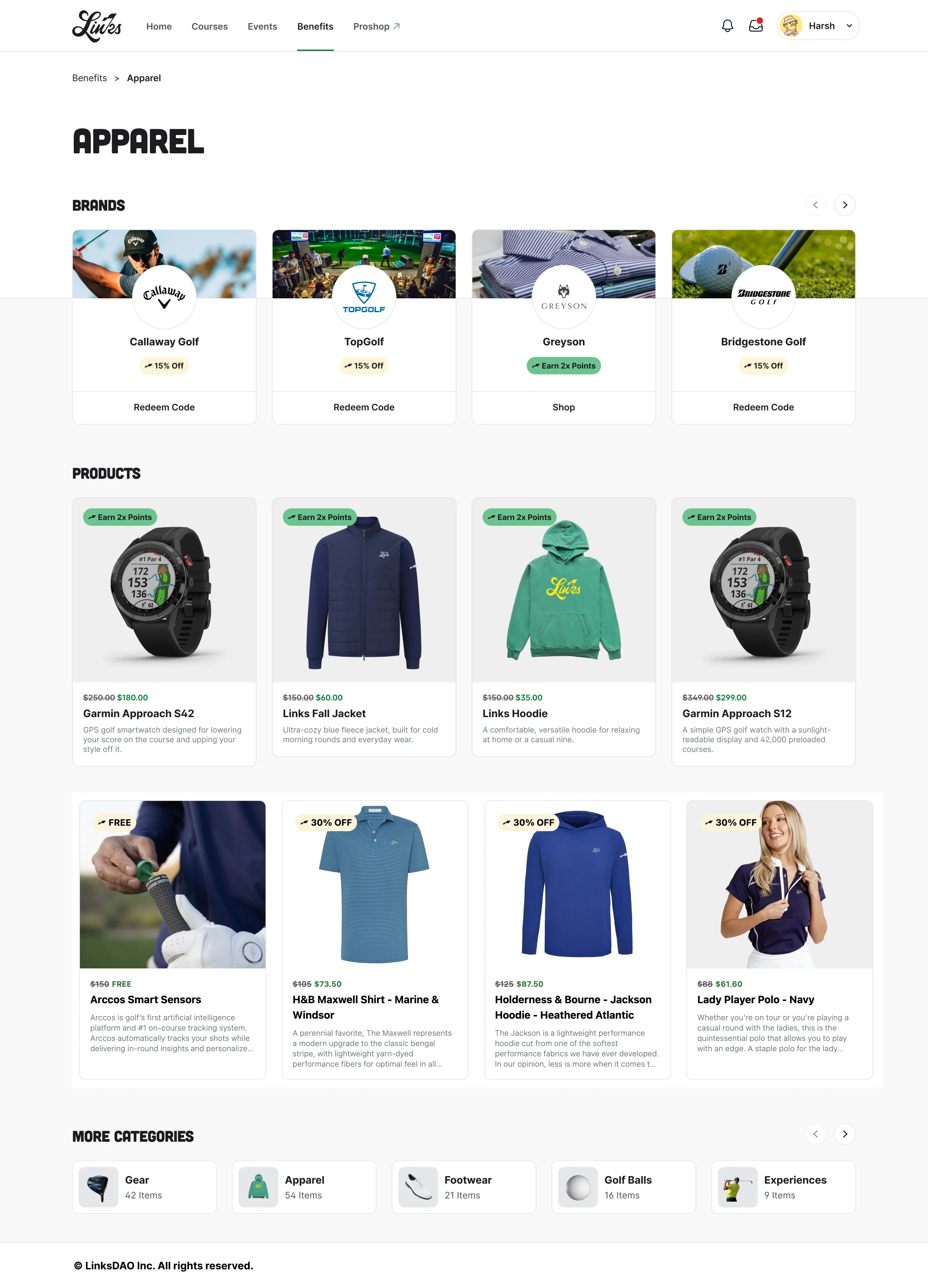
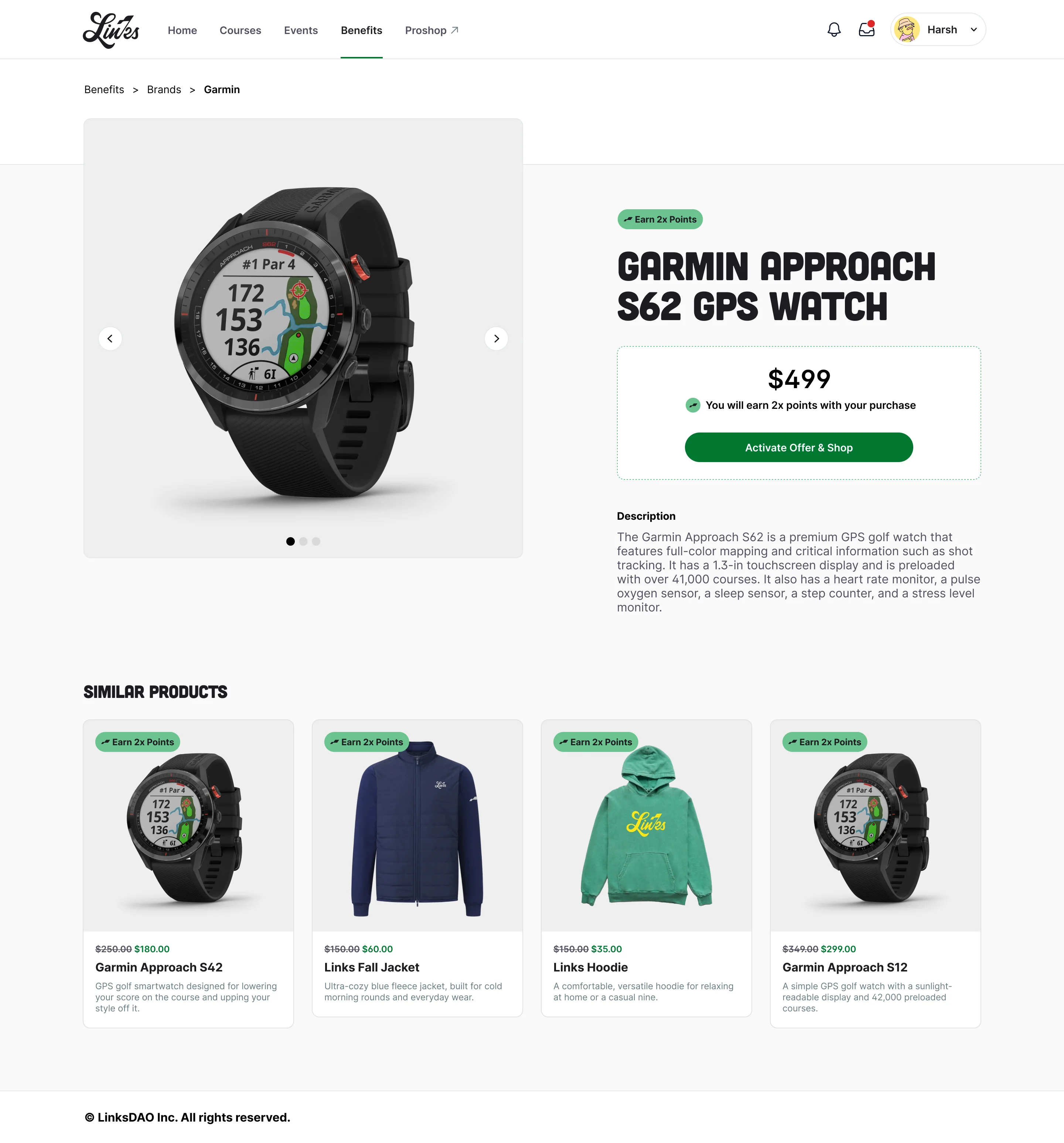
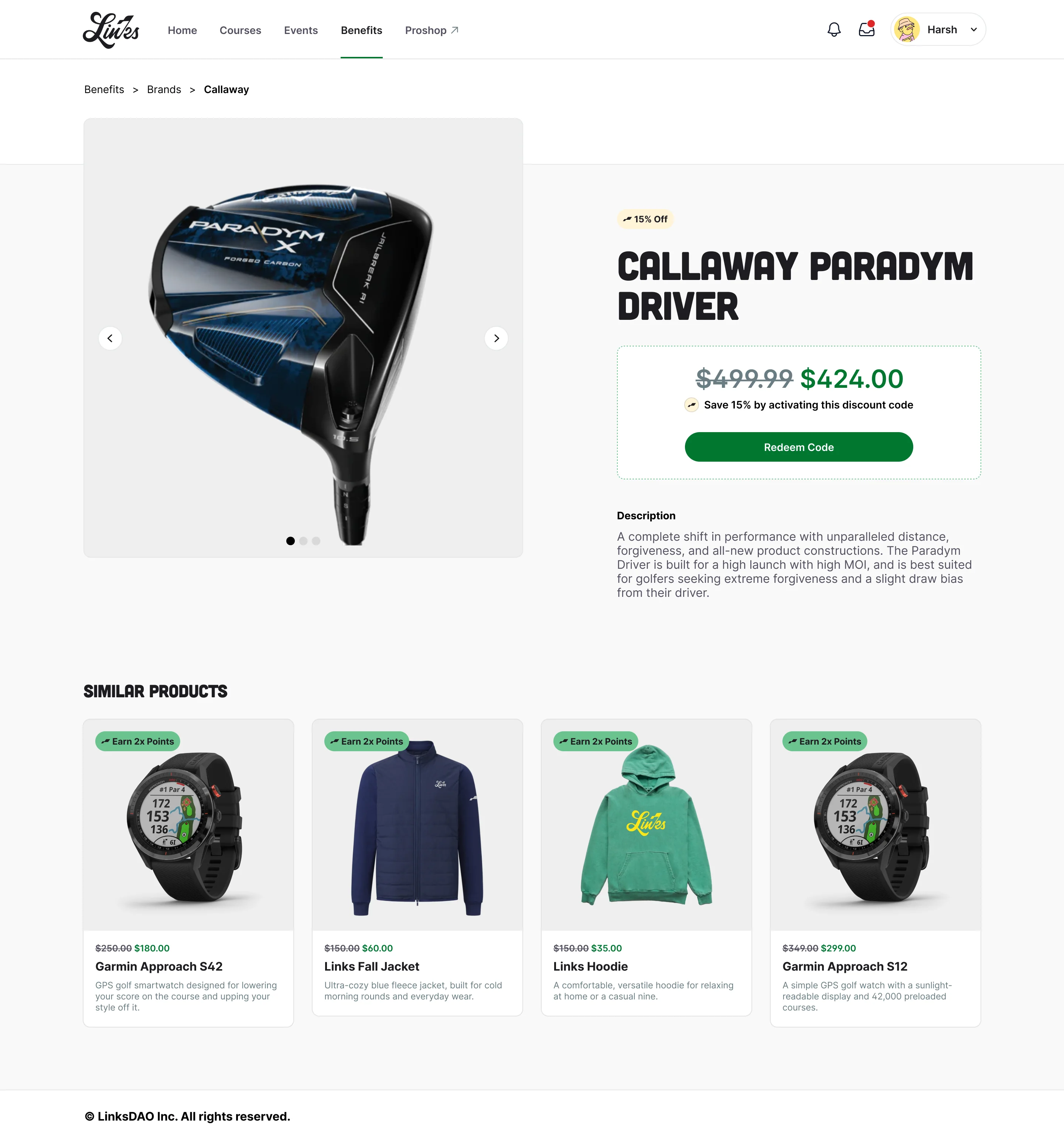
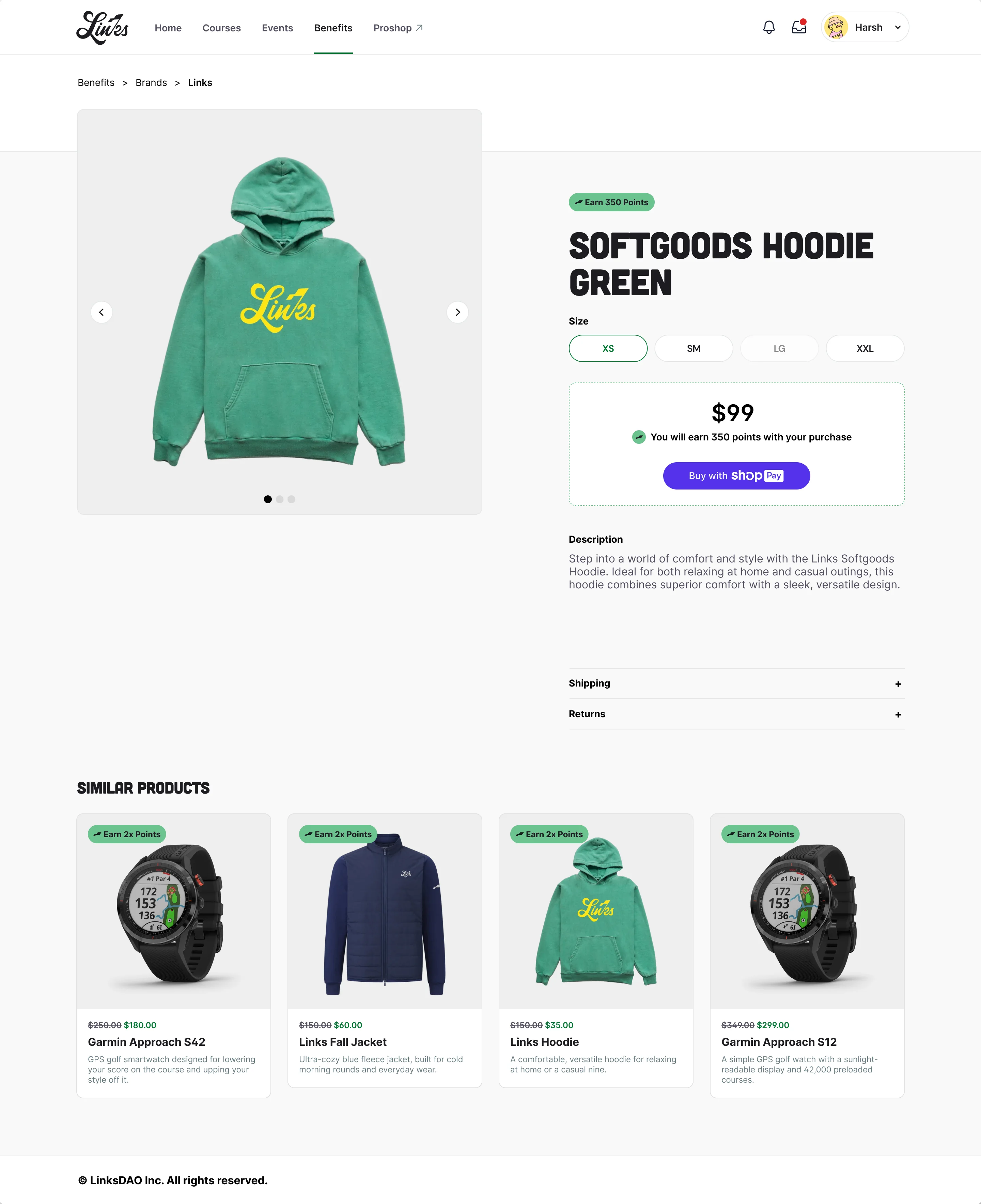
Some partners offer a discount and some offer points. Both use the same card with one tag slot: cream for a discount, green for points. The same templates cover Shopify brands and affiliate products.
- Chose
- One card and one tag slot for discounts and points offers
- Instead of
- Separate Discounts and Rewards sections
- Because
- Members shouldn't have to learn which section a brand lives in. The tag tells the type at a glance.
04 · Decision
Three ways to claim, one pattern.
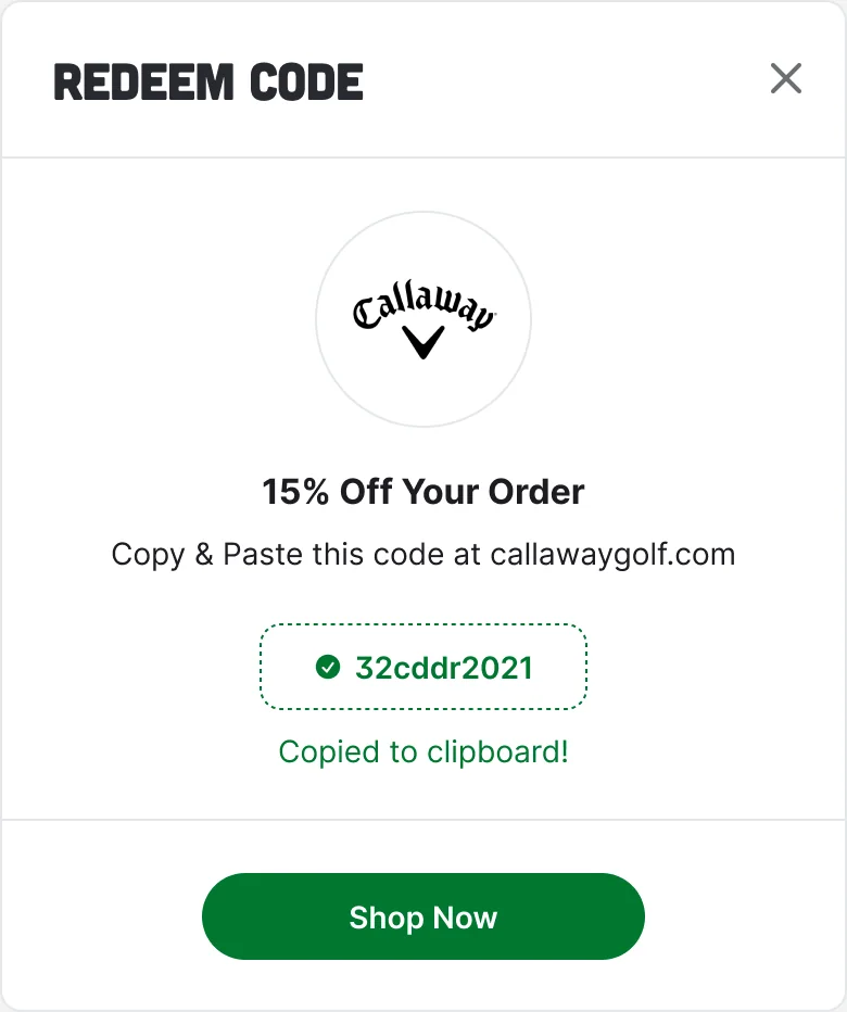
Partners integrate differently. Some need a referral link, some a code pasted at their checkout, and some can be redeemed inside the Clubhouse. Each benefit has one primary button, and its label says what will happen next.
- Chose
- One primary button per benefit, labelled by what happens next: link out, reveal a code, or redeem here
- Instead of
- Sending every benefit to the partner's site and leaving the member to work it out
- Because
- Links couldn't change how each partner integrates. A consistent pattern hides that difference from the member.
05 · Rewards
Points you can see, and spend.
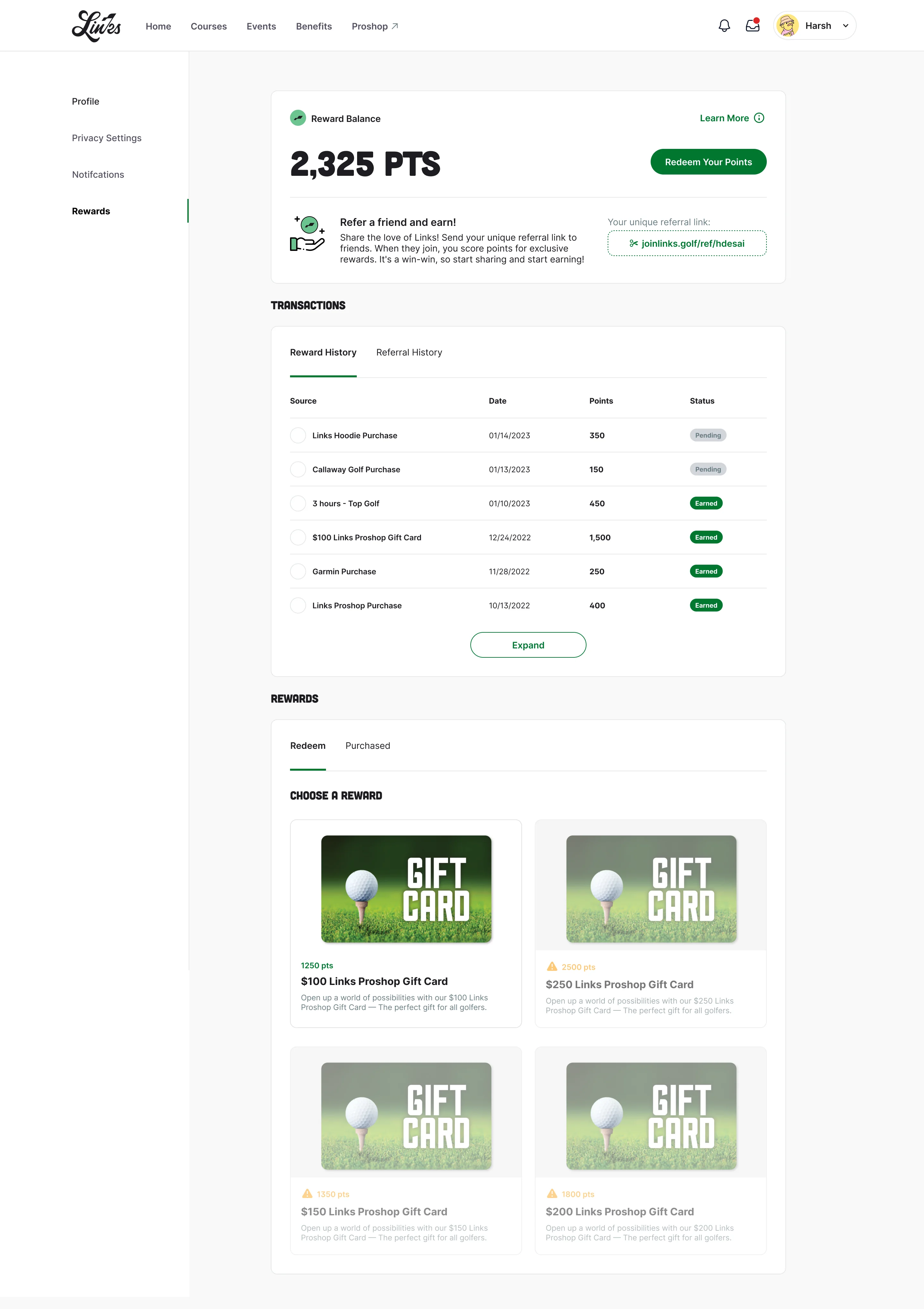
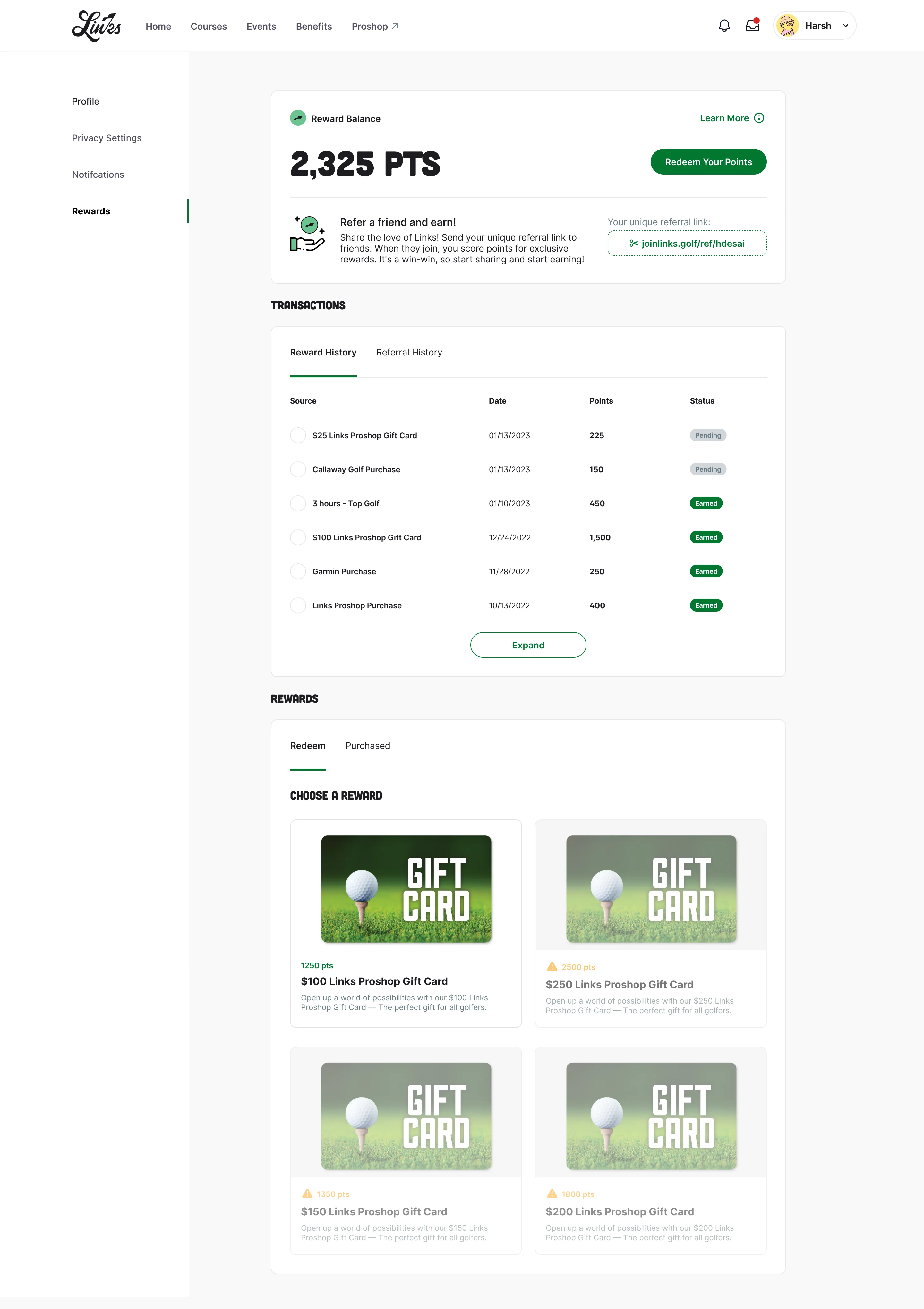
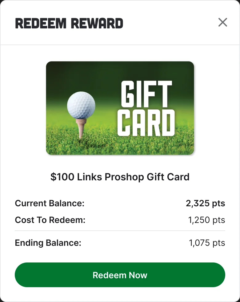
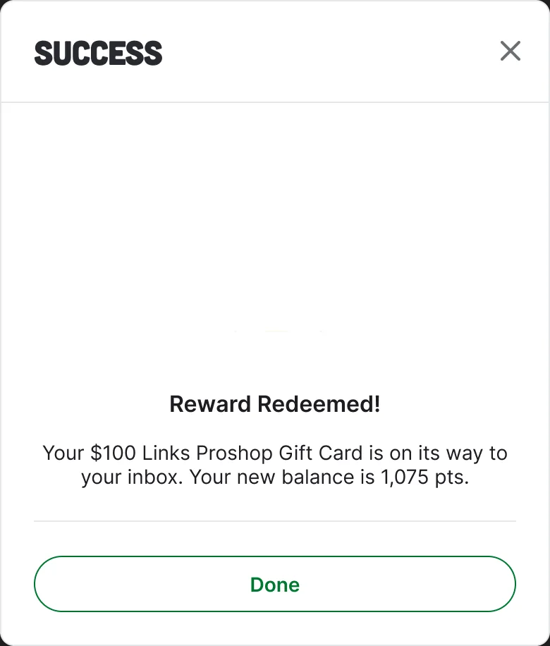
A rewards page shows the balance, a history with pending and earned entries, and a referral link. Points redeem for Links Proshop gift cards and other rewards. The redeem modal shows the current balance, the cost and the ending balance before the member commits, and says so plainly when there are not enough points.

06 · Onchain
Built for members who hold a wallet.
Membership is an NFT, in Leisure and Global tiers, and the profile shows the member's ENS name. Each discount code is tied to the wallet address of the member who claims it and works once, with three codes per member by default, so a partner's code can't be passed around. Points are recorded against the member, which is what later made them usable for the token distribution.
07 · Final screens
What shipped.
08 · Result
Shipped, and the points outlived the page.
The redesign launched in the Clubhouse. I was contracted for the design, so I don't have usage numbers and won't quote any. What I do know is that the points this system tracked were later used for LinksDAO's token distribution.